|
|
Aria ConnectAria Connect is employee benefits management solution that puts ease-of-use first, for both employees and Human Resources managers. |
This project was designed to replace an aging benefits management system that required Human Resources managers to contact the Technology department to make system changes. The UX and UI would be completely overhauled for both employees and HR managers.
After discussions with the client, I determined that my highest priority for the project would be ensuring an extremely straightforward, easy-to-understand experience for employees electing benefits. Mobile-friendly design was also critical, as many of our users access their benefit elections on their mobile devices.
My work primarily dealt with the side of the system that would be used by benefit-eligible employees. Because Open Enrollment was approaching, I decided that the benefit enrollment process and UI should be designed and delivered as soon as possible.
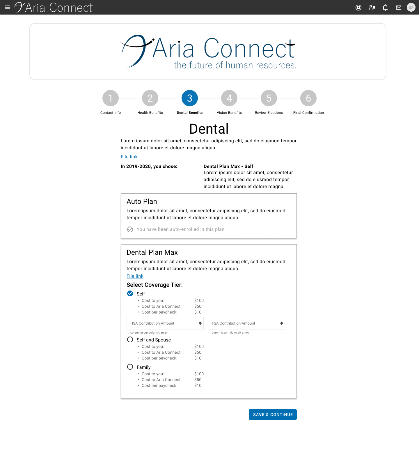
Enrolling in benefits can be a confusing process for any user. I needed to create a process and UI that wouldn’t overwhelm the user, while maintaining legal compliance. Taking inspiration from tax software, I created a process flow where a user can move step-by-step through their benefit options. Each step walks the user through an election category, where they can see the information most relevant to them – clear indications of their previous elections, the cost of each election, and the total amount they can expect to spend on benefits per pay period.
Only relevant options will be provided to the user – if the user is not eligible for a certain benefit category, the category will be omitted from that user’s enrollment steps. This keeps the process as streamlined as possible and maintains the user’s confidence in their selections.
The next major design in this project was the employee’s benefits dashboard, envisioned as a place for employees to see and change all their benefit information. A design did exist for this page when I joined the team, but after interviews with the client and users, it became clear that their requirements had changed. I began keeping centralized documentation for the team to keep track of the purpose of the project, its general requirements, and how our work would help meet the needs of the client.
In redesigning the dashboard, I spoke to the client and users about their reasons for visiting the dashboard. In almost all cases, users said that they were visiting the page to see their current benefits information, and enrolling only when they were prompted by the activation of a special enrollment period (e.g. the user received an email about Open Enrollment starting). The client stressed the need for users to understand how to start the enrollment process.
As a result, I pruned a significant amount of information and functionality from the dashboard. By and large, users did not seem interested in checking their new elections from the dashboard, and many did not even know it was an option. I realized that showing these elections from the dashboard used up so much space that it couldn’t be justified, and there already existed a view for these elections – it was presented to the user at the end of the enrollment process, complete with a printer-friendly view. I decided to remove this feature from the dashboard, replacing it with a small button linking to that page.
With that section of the UI removed, the entire dashboard could be reorganized. To replace a landing page with six paragraphs of text, I created a banner section to be enabled only during special enrollment periods, and gave the client some shortened example text to demonstrate how to use this space effectively. This allowed Human Resources managers to embed video and write their own brief explanations of how to enroll in benefits, based on which type of enrollment was active at the time.
The banner section also displays Human Resources contact information and the enrollment deadline, and prominently displays the button to begin enrollment – an element many users struggled to find before.
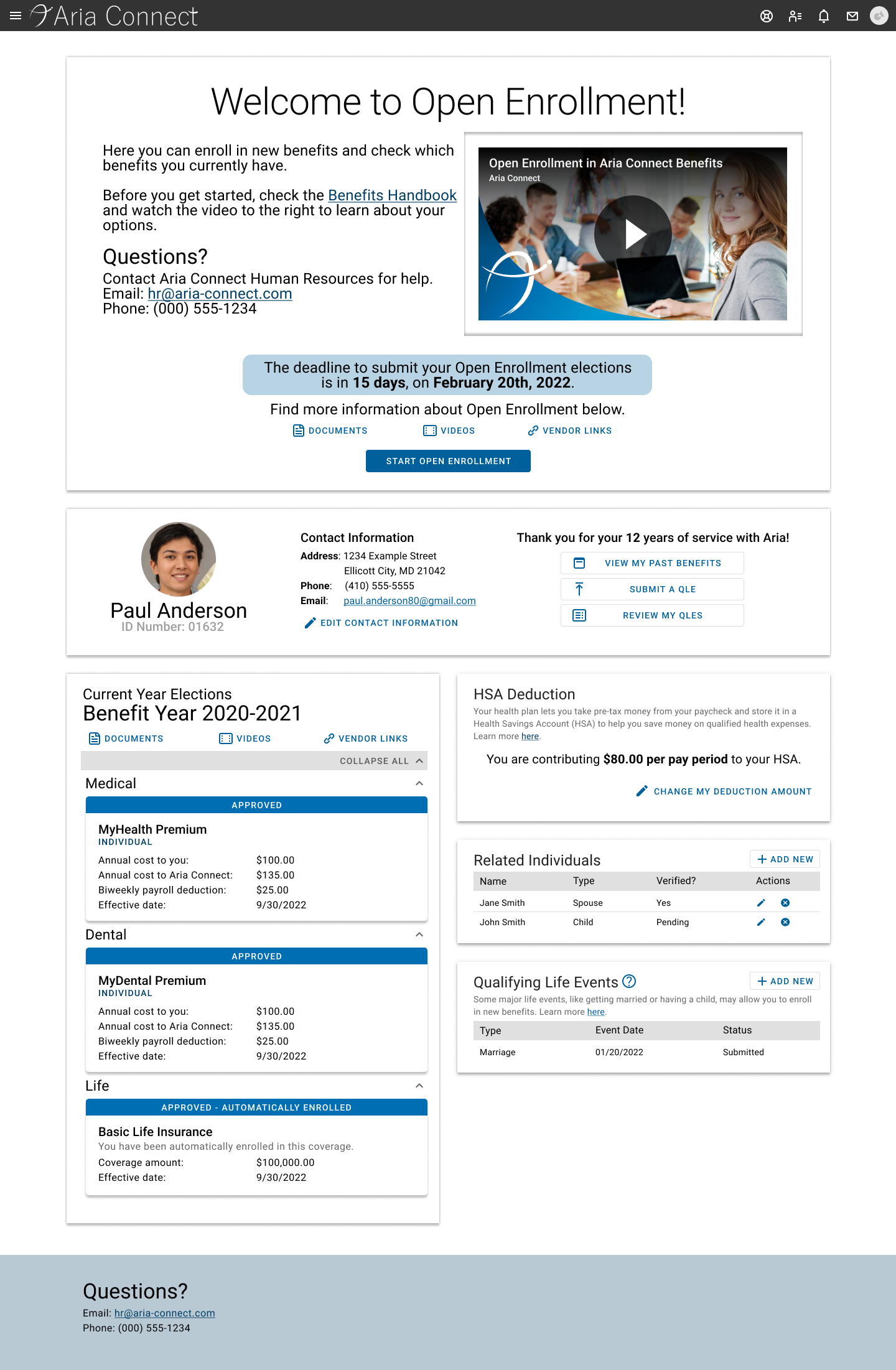
The rest of the page is designed for year-round use. A general information section along the top contains the user’s name, photo, and contact information. While this information is available elsewhere on the site, having it here serves a dual purpose: it grounds the employee, reminding them that this page is related to them personally, and it keeps Human Resources managers oriented when they are assisting multiple users with their elections. This section also shows the employee how long they have been working at the company, allowing them to understand certain benefit discounts, and has multiple buttons to view their past and future elections.
Below that, employees can see their current benefit elections – benefits that are currently in effect for them. In my research, employees rated this as the most important reason for visiting the dashboard year-round, so it takes up the entire left column. Here, users can find their benefit elections and costs, as well as links to their benefit vendors and documents related to their specific plans. In the right column, users can find other commonly-used features, such as HSA contribution editing, documenting related individuals, and submitting a qualifying life event for review.
What I Learned
Don’t be afraid to ask “why”
When I joined this project, I was still a little afraid to question the reasoning behind existing designs that were causing problems. When I started asking, though, I found out lots of information that could help us to improve our processes in the future. Many problematic designs were caused by misunderstood requirements, lack of information, or tenacious “placeholder” components – all things that could be mitigated with a few tweaks to the pipeline.
Understand the user’s motivations
The client requested a feature that didn’t make sense to the development team. Its development would have been costly, so just before the team started working on it, I asked for work to be held while I met with the client to see why they made the request. By asking for their perspective, I discovered that users had been using a time-intensive workaround to display information in a certain place; the feature they requested just codified that workaround. Once I understood their motivations, I was able to design a solution that eliminated the need for the workaround, but took just a few hours to implement, instead of two weeks.
Talk problems with the client, talk solutions with the team
When I joined the project, most of the design discussion was done in large, fifteen-person meetings between the development team and the client team. I started having quick, focused two- to three-person meetings with the client (who, in this case, were also users) to discuss only their experience with the system – no design talk at all. Once I had a clear picture of their experience and requirements, I went on to design a UX that would support them, then presented it to the development team to figure out implementation. The clients were pleased that they didn’t have to come up with their own solutions, and the team was pleased that all requirements questions were answered beforehand.
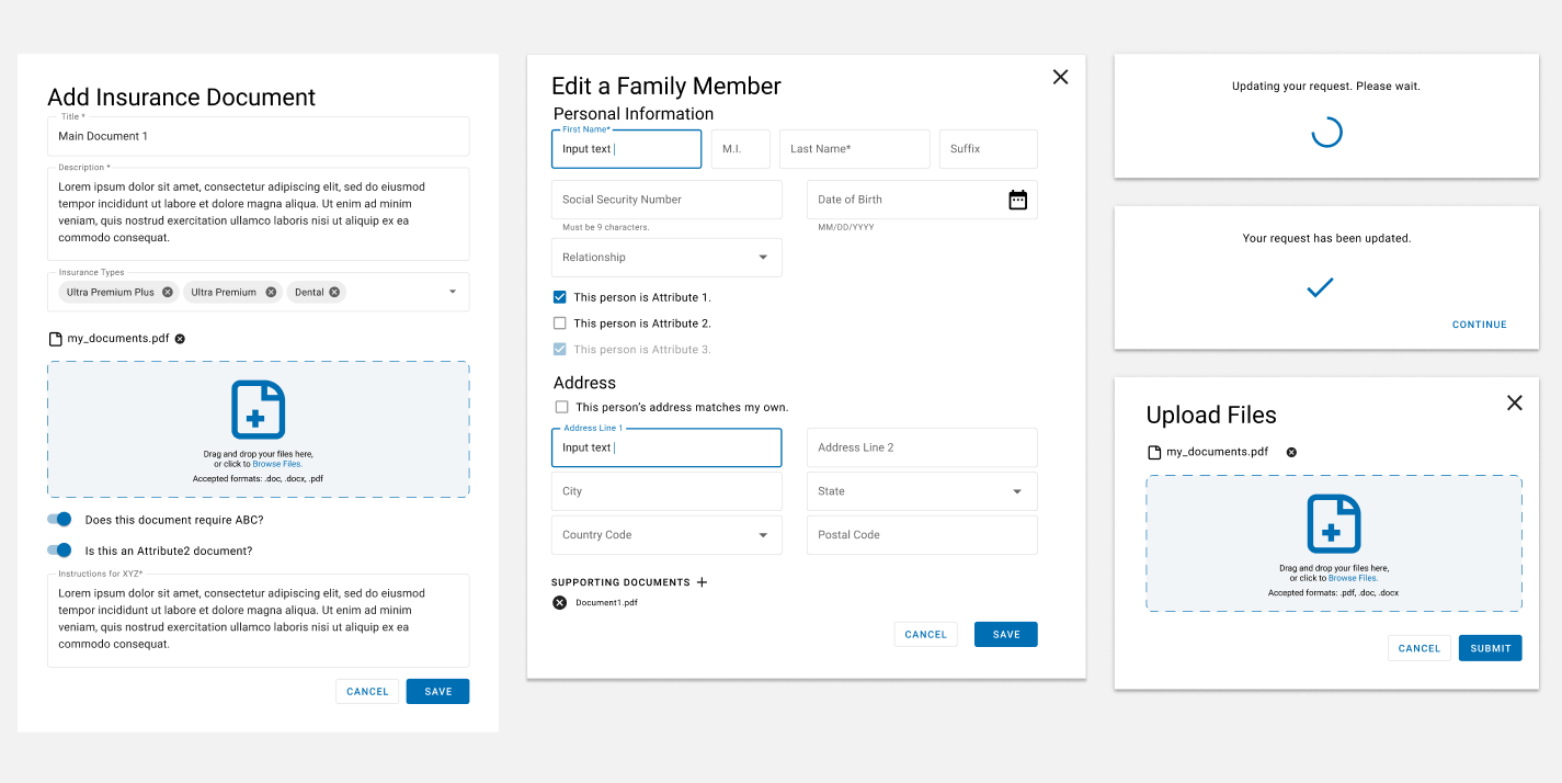
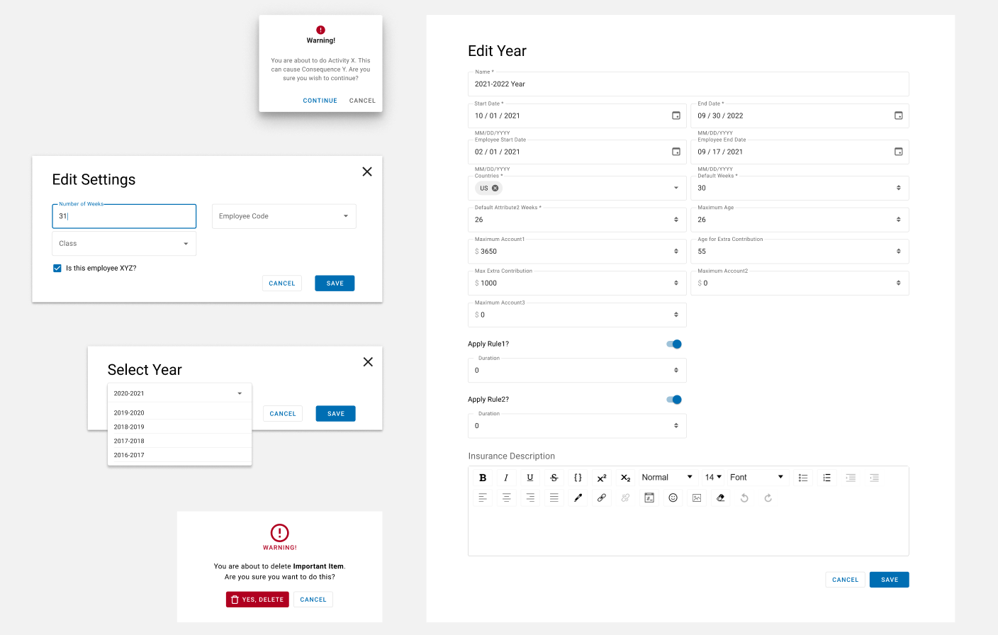
All Screens