|
|
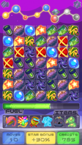
Galaxy Match-3Galaxy Match-3 is a match-3 mobile game. Match tiles to propel your spaceship through the galaxy – just be careful not to run out of resources! |
This simple Match-3 game design was based on other, similar games I’ve enjoyed in the past. The player must move tiles within a grid, matching them in groups of 3 or more to earn points. Depending on which tiles are matched, their resources can change – they may gain currency to spend on items, gain or lose moves, earn a score multiplier, or lose points. A level is cleared when a certain score threshold is reached, and each level has certain positive or negative multipliers attached to certain standard tiles.
From this design, I determined that these UI elements were needed for the main game screen:
Tiles
- Gain moves
- Gain currency
- Increase multiplier
- Lose points
- 4x Increase points (standard tiles)
Interface
- Progress/points indicator
- Items holder
- 6x Items
- Score multiplier indicator
- Moves counter
- Currency counter
- Background
- Grid
From here, I started thinking about what theme I could use to tie all these elements together. The tiles within the grid are what the player will interact with most during gameplay, so I decided to focus on those when brainstorming themes; the informative UI elements could be designed to fit with whatever theme worked best for the tiles. I quickly landed on a space travel theme – once I began thinking of the player’s available moves as fuel, it became much easier to think of identities for the other elements.
I decided on these general identities for each asset:
Tiles
- Gain movesFuel
- Gain currencyCredits
- Increase multiplierShooting Star
- Lose pointsBlack Hole
- 4x Increase points (standard tiles)Planets
Interface
- Progress/points indicatorShip
- Items holderMetal (within Ship)
- 6x ItemsStrange Alien Artifacts
- Score multiplier indicatorShip Console
- Moves counterFuel Meter
- Currency counterShip Console
- BackgroundSpace
- GridStandard, unobtrusive dark grid
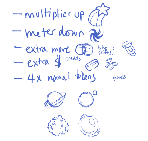
Before I continued, I needed to brainstorm what exactly to draw for each of these assets.
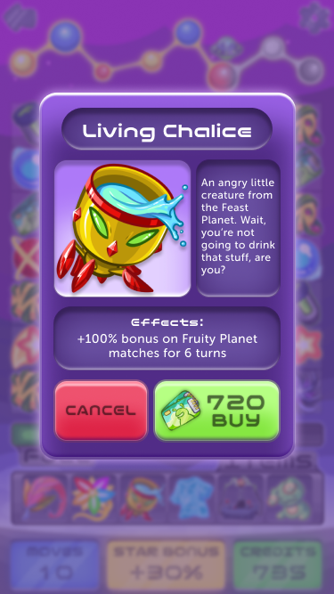
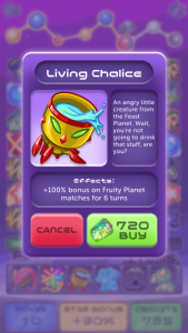
A modal for purchasing items using in-game currency, triggered when the player selects an item from their item tray. Purchasing the item immediately deploys it in the game. Item art, effects, and available functions are prominently displayed. This modal scales vertically based on the amount of text in the Effects section.
Creating these items was so much fun! I thought of them as bizarre souvenirs from the alien planets you visit throughout the game.
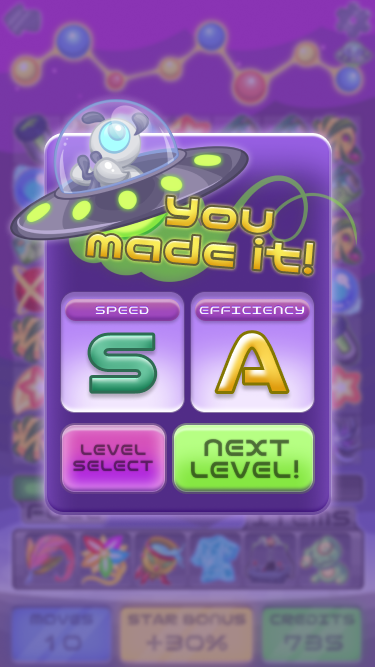
This success screen is displayed when the player successfully gains enough points to complete the level, giving rankings for player’s performance. Meant to be the favorite screen of perfectionist players!
A simple letter ranking system rewards quick thinking and efficient use of resources, without getting too bogged down in statistics.
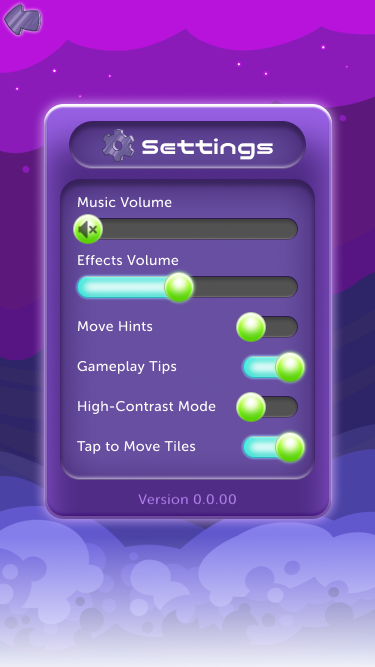
Settings menu, with additional accessibility settings. The AbleGamers Accessible Player Experiences (APX) tool was used throughout Galaxy Match-3’s game design and visual design to reduce barriers for anyone who wants to play.
The large slider handles give the player enough area to control the slider, but this can obscure the slider track when the handle is pulled to the extreme left or right. A mute icon is used when the slider is at 0 to maintain that visual distinction.
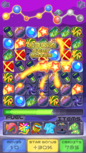
A fanfare screen demonstrating the visual effects triggered when a player makes a successful move. Players should be rewarded for good moves with satisfying visual effects showing off the impact that their move has on the grid!
What I Learned
Document your styles diligently
It’s easy to forget things like brush sizes and color palettes when stepping away from a project. I learned early on that planning and documentation is the best way to save time in the long run. This can be done more easily in wireframing programs by registering styles and components, but moving between programs meant that I had to carefully document styles in a central location. Fonts, brushes, icon dimensions, even the zoom levels I work at were documented – saving me lots of headaches when I tried to figure out how I achieved a certain effect a month prior.
Look to genre standards as a baseline for what users understand
As a game, Galaxy Match-3 isn’t a novel concept. Most players already have a good understanding of how match-3 games work, and if they don’t, they’ll pick up on it quickly with minimal instruction. This is only possible thanks to the design language built up by the match-3 genre over decades. Taking design cues from other successful products is a great way to save time solving UX problems.

