|
|
Know-Your-Customer Training GameA training game for English and Arabic speakers to learn about safe, responsible chemical distribution practices. |
I worked as a UI/UX designer for a know-your-customer training game. The client was an independent nonprofit organization that promotes nonproliferation of chemical weapons. This project has shipped, and is in private use by the client.
In the chemical industry, standard practices and regulations exist to prevent the misuse of potentially dangerous chemicals. One of these practices is know-your-customer (KYC) checks. People involved in chemical distribution should perform checks at each step of the sales process – for instance, is this customer’s company properly registered? Is it unusual for such a business to order this chemical?
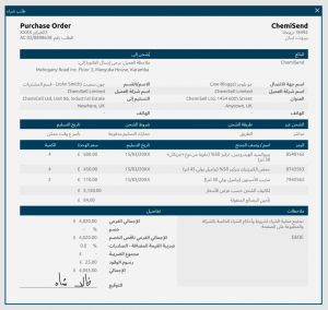
The goal of this project was to create a game that trained players to understand these KYC checks, and to see the potential consequences when these checks are ignored. The game had to be shipped in English and in Arabic, so designs had to be created for both left-to-right and right-to-left text directions.
I was brought onto this project midway through its development, so I missed out on the initial design phase. As I was getting up to speed, I found that there was a lot of confusion about the project. There didn’t seem to be a singular vision, and no one was willing to commit to specific details. The only existing documentation was in a series of heavily marked-up, contradictory Word documents. They comprised client meeting notes, brainstormed ideas, and strict requirements, with no markings to indicate which was which. It was extremely confusing and difficult to use, which led to a lot of frustration from the team. I saw that the UI/UX work could be delayed while engineers worked on other things, so I asked to switch my focus to the creation of a centralized documentation wiki for the project. Although I did a lot of UI/UX work on this project, I spent many hours creating the knowledge base, so I’m writing about that first!
I used Confluence to create the knowledge base; I had experience with it, and since we already used Jira for organization, it was easy to connect the two. I divided the knowledge base into three categories:
- Chapter Mapping – The game was divided into three chapters, each with certain storylines affected by the user’s choices.
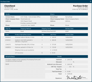
- Articles – Within each chapter, documents and news articles would be displayed depending on the player’s choices. I wrote some of the articles, while others were provided by the client. All Arabic translations were provided by the client.
- Meeting Notes
For each chapter within the Chapter Mapping section, I carefully read through all the existing documents, then picked out everything that was relevant to specific chapters and sorted them into their own pages. I then wrote a moment-to-moment walkthrough of each of these chapters, outlining the different choices, their point values, notes and questions, and any relevant aspects of the experience the reader should know. To streamline the text, I removed all the embedded articles and documents, replacing them with a link to their own pages in the knowledge base. A linked table of contents was also created for all applicable pages. All the documentation was carefully written, formatted, and tagged so that the engineers could quickly find what they needed.
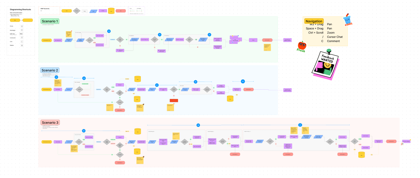
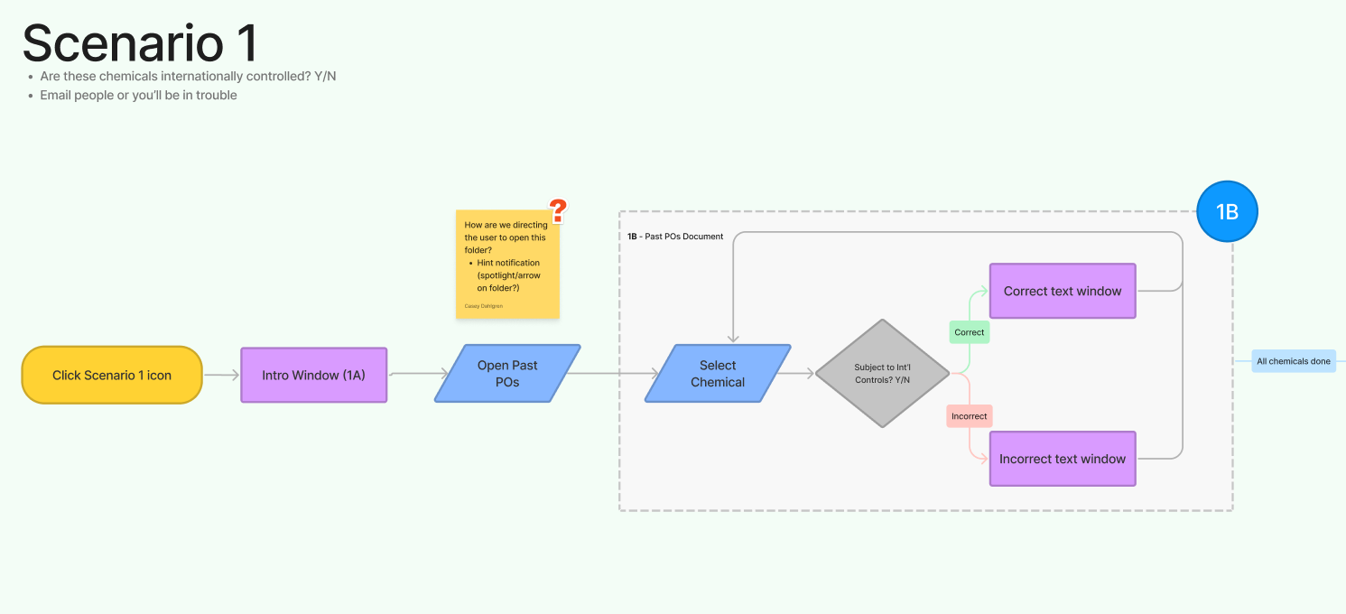
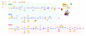
In addition to the written chapter maps, I used FigJam to create a flowchart for each chapter. I wanted to provide a quicker, more approachable reference for the complex scenarios. Numbers within the flow chart corresponded to document titles and chapter sections within the knowledge base.
Creating the knowledge base took a while, but the rest of the team was happy with the results! We began to use it and update it frequently.
Once that was done, I was able to start on UI/UX work! Honestly, creating the knowledge base required me to ask questions and have discussions with the team to fill in some UX gaps, so much of the UX work was already done. It was refreshing to jump into wireframes after so much research and documentation!
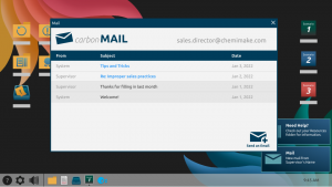
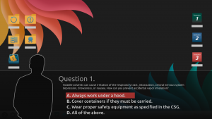
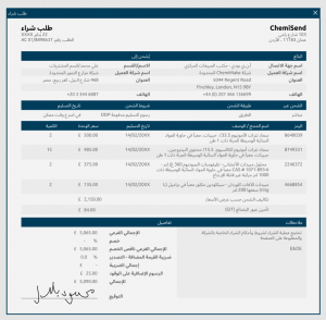
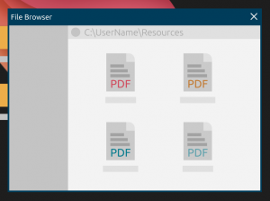
The base visual design work had already been done – the UI was all diegetic, taking place on a faux Windows desktop screen. The user would communicate with other characters and receive information via email, and they could open their reference documents by accessing desktop folders. The only exception to this theme was a dialogue question-and-answer sequence.
Other than the desktop background, I created, remade, or reformatted all pictured interfaces and assets.
For my part, I created several new interfaces and vector icons within the established style. I also remade some of the existing UI so that it could properly scale, and reformatted much of the styling to ensure consistency, readability, and properly licensed fonts. A taskbar was added to give the player easy access to navigation and settings.
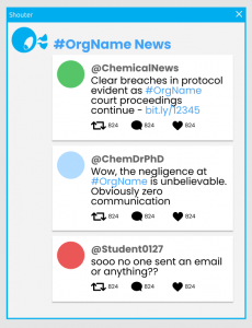
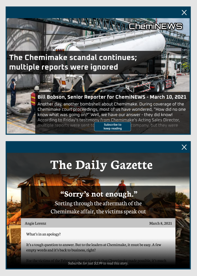
In one game scenario, after a negative news event, the player is shown lots of popup windows with news articles and social media feeds talking about it. The articles only appear briefly, so there was no need to make a full, detailed page; to hide the lack of content, all the fake news articles have a paywall.
Turnaround on this project was very quick, and there was a lot more the team and I wanted to do. But I’m proud of what we accomplished in a short timeframe!
What I Learned
Documentation is critical to project success – and it's everyone's job
A lot of the problems on this project could have been avoided with a strong documentation initiative. Every time a problem is solved or a decision is made, write it down! Preferably in a searchable, accessible place.
Everyone should be held accountable for writing and reviewing project documentation. It's not a luxury, it's a necessity. No one person should be solely responsible for taking notes or chasing down decision-makers.
Design with scaling in mind
The first week I was on this project, I watched the client open the test build – on their massive 4K monitor. Our UI hadn't been given any scaling behaviors at all, so the content windows were tiny. So, so tiny.
Scalable UI is an important element of accessible design, but it's also an important element of not embarrassing yourself in front of the client. Design and implement scaling behaviors early on – they're way harder to add later, anyway.
Get your fonts in order early, save your future self the headache
It's really not fun to have to switch around your fonts when they turn out to be unsuitable for your use case. It's easy to pick a nice-looking font from the preview menu and work with that, but when you suddenly need extrabold text, or Arabic glyphs, or a % sign, will that cool font be there for you?
Study your fonts before using them! Do they have all the weights, styles, and glyphs you might need? Does it support the ligatures and accents necessary for your target language? Is it even feasible to license the font? Choose carefully, and you won't have to reformat all your interfaces if something doesn't work out.

