
|
|
Medical Education Mobile Game (Unreleased)A game for doctors to sharpen their knowledge in just a few minutes a day. |
Due to non-disclosure agreements, I can’t publicly share details or images. Please email me if you’d like more information.
I did initial UI and UX design for an unreleased mobile educational game for doctors. Due to the contract’s schedule, I mostly worked alone, with some assistance from the game designer.
Our contract did not begin with a written work order or requirements document from the client, so the first step was requirements gathering. The clients had an extremely busy schedule, however, and did not have a solid idea of their requirements. To get the ball rolling, the game designer and I collaborated on a pitch document and presented it to them, hoping they’d approve it. The designer did a fantastic job synthesizing lots of disparate ideas into a single, cohesive game.
The clients wanted a study game for the continuing education of doctors, specifically doctors who specialize in cancer treatment. For gameplay, they requested small “minigames,” particularly a matching game and a game where cancer is the “enemy” and treatments are used as “weapons.” The clients also stressed that their target audience is short on time – they should be able to make progress by playing just a few minutes here and there.
For our pitch, we suggested a game where the player must treat a patient by playing multiple minigames:
- The first minigame is a quiz-style game – the player must look over the patient’s intake documents and, if necessary, order tests. Selecting the proper tests will reveal observations for use in the following minigame.
- The second minigame is a matching game – the player must match their observations to the proper course of treatment. Correct matches will grant the player a bonus powerup in the following minigame.
- The third minigame is a different take on a bullet hell game – in the center of the screen is a tumor spitting out cancerous cells. The player controls a ring that surrounds the tumor, but the cancerous cells can damage and destroy parts of the ring. By moving the ring around to block the cells, and using the powerups they’ve earned, players must try to prevent the cancerous cells from escaping.
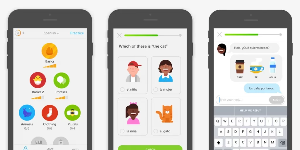
For the non-gameplay experience, Duolingo was our primary inspiration. Duolingo is a language-learning app that divides its lessons into tiny chunks. Players are given bonus rewards for playing consistently, even if they only play for a few minutes each day. With a curriculum provided by the oncology experts, we felt that this game could be a fun way to keep one’s knowledge sharp.
The clients liked the idea, so I set to work creating high-fidelity wireframes! Since this app is mobile-only, I used Material 3 as the design framework. For players with no time to spare, using a familiar interface style felt important! For the color library, I used calm, light colors that matched the client organization’s branding. Most of the UI outside of the game is very clean and minimalistic.
For our target audience, clarity and readability always comes before visual flair. But we can’t have a game without some fun UI! Once the basic wireframes were set up, I created vector images and icons to liven things up:
- During the initial intake process, the player is given the patient’s documents on a clipboard. The documents are structured like a minified patient record, including their name, pronouns, sex, photo, and medical history. When the player is finished reviewing these documents, they swipe up to dismiss them; the papers animate into a small manila folder, the patient’s file.
- For the quiz minigame, the player must decide which tests to order for the patient. The UI is structured like a laboratory order form, complete with the lab’s logo. As the form is filled in, the text appears in a handwritten font, and boxes are checked with a pen. When the form is submitted, a fake signature is scrawled on the bottom.
- In the matching minigame, the player must match treatments to observations. The observations are printed on a sheet of paper on one side, and the treatments are on the right, in a handwritten font, on sheets of prescription paper. They even have a copy-proof pattern on them! The player must rearrange the treatment sheets to match the proper observation.
The clients seemed very happy with this direction! Once the initial design was finished and documented, I got final approval from the clients, then handed it off to the engineering team for the next phase of development. I’m looking forward to this game’s announcement so I can share some cute visuals!