
|
|
My StationMy Station is an app to help you organize and manage your stationery collection. |
I’m a big fan of cute stationery – pens, paper, even tape! I’ve collected so much over the years that sometimes it’s hard to keep track of what I have. I wanted a simple solution that kept the cute look of the stationery I love.
To start, I consulted some of my stationery-loving friends to see how they might want to organize their stationery collections. I decided that My Station should support these major use cases:
- I’ve just purchased a new item. I want to add it to My Station quickly and easily.
- I just used some of my collection. I want to adjust my inventory.
- There’s something unusual about this item. I want to add a custom field for it.
The first thing I did was wireframe a home view for the app. The look of the app was key – I wanted the user to be able to see and appreciate their collection!
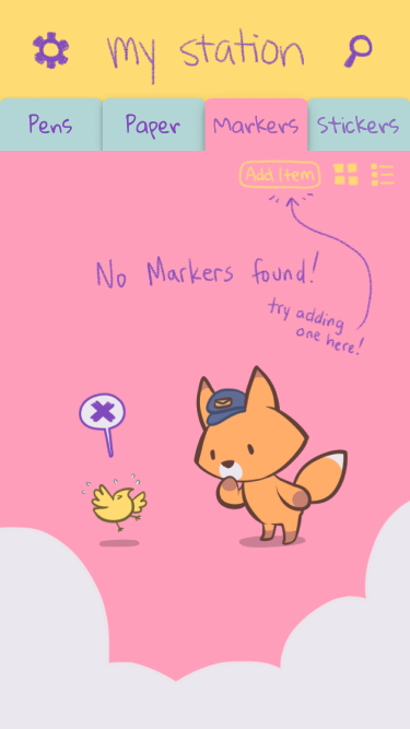
I decided on a grid view for the items, with different tabs based on user-defined categories.
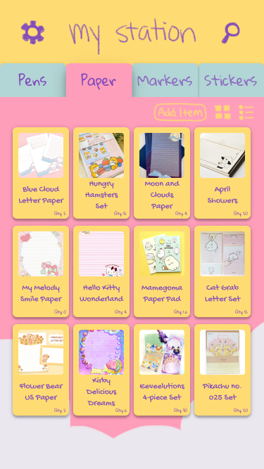
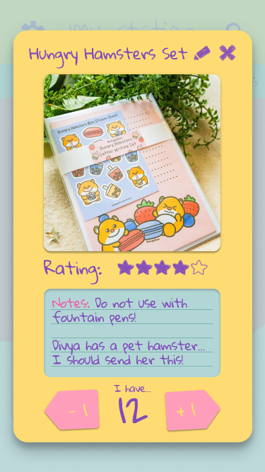
Next, I wireframed the item modal overlay, triggered when a user taps on one of their items. This overlay shows the user a photo of their item, plus any fields they’ve added, including rating, notes, and quantity.
The quantity field is anchored to the bottom of the modal so that no matter how many fields are attached to the item, the user can always adjust their inventory right away when the modal is opened.
It was important to me that the app be cute! I wanted it to reflect the type of stationery that users like myself would add to their collection.
I began testing color palettes based on bright pastel colors, and even illustrated a pair of mascots, a chick and a fox. The elevations of each element are meant to remind the user of stacked paper and sticky notes, with hand-drawn fonts and icons to reinforce the app’s casual, fun feel.
What I Learned
Reinforce your theme everywhere
Let nothing escape! Well, unless it’s called for by accessibility standards. Designing My Station allowed me to think about how every aspect of the design can contribute to the overall UX, and how that extends to the visual design as well. It was fun to push the stationery look as far as I could, and I think it makes the overall experience much stronger and more memorable!
Use the tools available to you
Figma released the Variants feature while I was midway through this project, and it made a huge difference in my workflow. The amount of time that it took to create a component with multiple states shrunk significantly, and it became even easier to add states and variants beyond what I had initially planned. If I hadn’t experimented with the feature right away, My Station would have taken even longer to build.
All Screens